Hi everyone,
My website is up and running! I had a lot of fun designing the layout and uploading all the pictures. The link to the website is www.cleopatrachilds.com . It is definitely still a work in progress, but I am glad that I finally got the hang of web designing. I think with more practice, my website will get better and better.
Looking forward to hearing your feedback and seeing all of your websites!
Cleopatra's Blog
Monday, April 24, 2017
Saturday, April 22, 2017
Home Page and Navigation System, Final Project (Part 1)
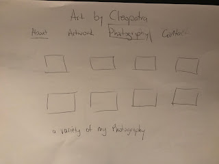
For my website, I want to keep it quite simple and focus on my artwork and photography. I will use the name "Art by Cleopatra". This will be on the header and the color of the font will be grey. I will have tabs on the front page for "About Me", "Artwork", ""Photography" and "Contact". I will also have three pictures of various pieces I have created.
For the "About Me" page, I will have a picture of myself from one of the exhibitions I have taken part in. I will also have some information about myself. For the background I will have a transparent collage of my different works.
For the "Artwork" page I will have photos of my different kinds of paintings. The mediums I use range from paints to coffee, so I want to showcase all the different artworks I have made.
For my "Photography" page, I will post different types of photos I have taken. I will keep it simple, so the focus can go on the photos.
For the Contact page, I will have my name and email address, plus all the different social media sites I am part of. I will also have a name, email and comments section for the visitor.
Friday, April 7, 2017
Photo Retouching ( Part 2) -My Yiayia
Hi everyone! Here is the retouched photo of my Yiayia (Greek for Grandmother). This has been one of my favorite assignments we have done. I feel that by retouching this photo, I have learned so much about using Photoshop. Some tools that I used to transform this picture are the clone stamp tool, the paintbrush and the blur tool. In order to achieve the change of color I had to make many duplicate layers, manipulating each one as they were added.
Overall, I am very happy with the outcome. I showed my Mother the photo and she started crying. She couldn't believe it was possible to fix a picture that was so damaged.
Saturday, April 1, 2017
Photo Retouching (Part 1)
For this assignment I have chosen to retouch a photo of my Grandmother. This is one of my Mother's favorite photos of her Mom and she displays it very proudly in her living room. Due to the age of the photograph, it has a lot of wear and tear, but thanks to this assignment I will be able fix that. As you can see from the original photo, there is quite a lot of damage. So far I have been able to fix the main creases on the face and body and also have changed most of the color. There is still a lot of work to be done, but so far I am happy with the results.
 |
Saturday, March 25, 2017
Book Cover Design (Part 2) - The Alchemist
The book cover I chose to redesign is The Alchemist. For the front cover, I decided to go for a white background. The reason for this is that it is different from the other designs I have seen for this book. The story is set in Egypt, so I decided to use an image of the Pyramids. I used Photoshop to alter the image. This was done by selecting the image and then going to image, adjustment and then posterize. I really like the effect this adjustment gave the photo. I think it is quite striking against the white background.
For the back cover, I chose an image of the sun, as it is a sign in Alchemy. I used it as the background and changed it by adjusting the brightness and contrast. I then added the description paragraph and the publishers logo and barcode.
Overall, I really liked this assignment. I have learned to use so many different tools on Photoshop. I have also been able to change my way of thinking, regarding book covers. My trips to the bookstore will be forever changed. Now every time I look at a book cover, I will think of a way to redesign it.
Sunday, March 19, 2017
Book Cover Design (Part 1) -The Alchemist

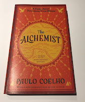
The book I last read was The Alchemist by Paulo Coelho. This is my third time reading this book as it is one of my all time favorites. It is about a the journey of a Shepherd boy that travels to Egypt to find treasure. Along the at he learns many valuable lessons and how important it is to follow your dreams.
For the first design, I thought of having the pyramids in the middle with a camel. This signifies the journey to Egypt and the desert. The back cover will have the text and a smaller image of the pyramids.
For the second design I thought of having the pyramids with the title written in the middle and underneath a phrase that says "A book about following your dreams." The back cover will again have the pyramids but on the bottom and the text.
For the third designs, I chose to have a sun in the middle with the pyramids inside and an image of the shepherd boy. The title will be on an arc and the authors name will be on the bottom. The back cover will have an image of a bird flying , the pyramids on the bottom and the text in the middle.
Friday, March 3, 2017
Erase Bullying
Subscribe to:
Comments (Atom)


